
Happy Dog Explore: A Solution To Find Pet Friendly Place Near You

I was responsible for all aspects of the UX Research, UX design, and UI design.
Project Overview:
This project started from an issue I noticed with pet owners in the city. They always wanted to bring their dog with them but struggled to know what places dogs were allowed.
The Challenge (Problem):
We aim to help dog owners navigate cities with their pet companions. We need to test the assumption that it is difficult for dog owners to find new places and activities in the city.
Solution:
The goal is to create a product that will help provide a better experience for dog owners in cities, by solving the main issues dog owners have living in the city with their pet.

Primary Research
Secondary Research
In order to determine what exactly the problems and issues were I leaned into secondary research. I searched through the internet to learn more about dog owners and their dogs.
These are the questions I used to learn more about my problem:
● Why is it difficult to have a dog in the city?
● Who (audience) is struggling with a dog in the city?
● What are the main causes of this struggle?
● How are these people currently doing in the city?
● What alternatives or solutions make living in a city with your dog easier?
Below I reduced my results to some key Insights:
❖ Owners lacked resources to find new places.
❖ A dog’s daily routine is super important
❖ Socialization is very important to dogs.
❖ Dog etiquettes and laws should always be followed
User Interviews
After conducting research I conducted 5 user interviews that were each 45 minutes. I used these interviews to gain insight about the problem and to better understand my users. This allowed me to approach the rest of the design process with a better understanding of my users’ behaviors, pain points, needs, and goals.
I created a screener then selected the participants who met the following criteria. When selecting Participants I used the following Selection Criteria:
● Should live in a major city
● Own a dog
● Use a smartphone
● Owner should actively look for places to take their dog
Synthesis
I synthesized the key findings from each of the user interviews and separated them into themes:
● Information about dogs
● Walks/ Daily Routine
● Favorite Places & Activities for Dog Owners and Dogs-
● How They Find Places
● How They Get Places
After all the notes from each interview were separated. I took the key findings from each theme to create quantifiable data and used that to start crafting my design solution.
Ex.
How they find places
5/5 use word of mouth
4/5 googling
4/5 social media apps
After interviewing five individuals I used their responses to inform my design solution. I focused on the most common problems apparent in interviews and secondary research to be the key scope to assist in building a design to help dog owners. I used this information to create a Persona's, Empathy Map, and How Might We Questions.
Personas
I crafted user personas to represent the insights I gathered from the interviews. I wanted to ensure user needs were at the forefront of my design and found having personas would pave the way for that to happen.
Key points I touched upon in creating my personas:
❖ The importance of socialization for owners and their dog
❖ The want to explore and do new things
❖ Emphasis that new activities were convenient and fun


Empathy Map
When creating the empathy map I really wanted to understand the feelings of my users. I used the empathy map to organize the insights, observations and quotes from the user interviews.
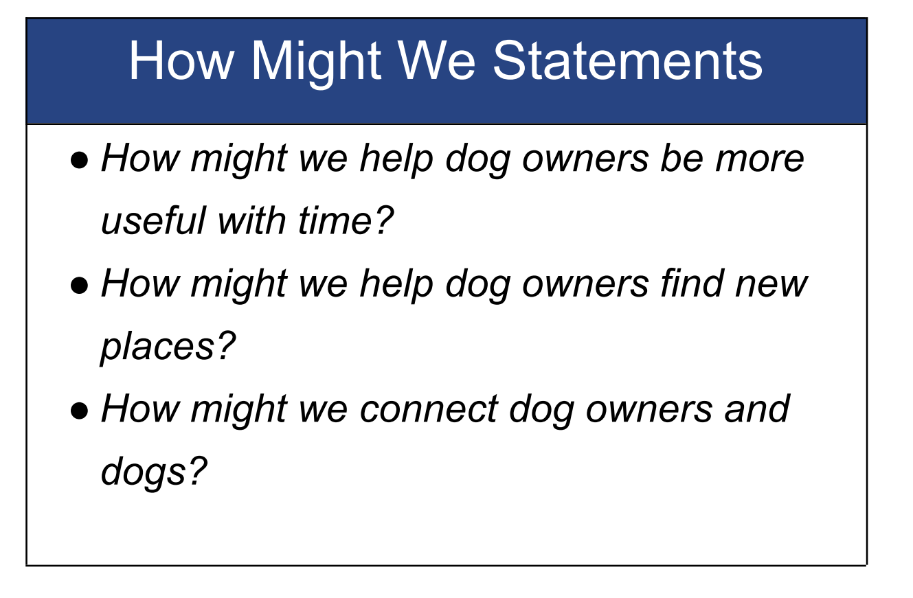
Top 3 How Might We Questions
After creating my empathy map and personas I used the organized insights to start developing the problem statement. I framed the problems as How Might We Statements to focus on the problems I wanted to solve in my design solution. I used my insights to craft the following How Might We statements.
UX Design
User Stories
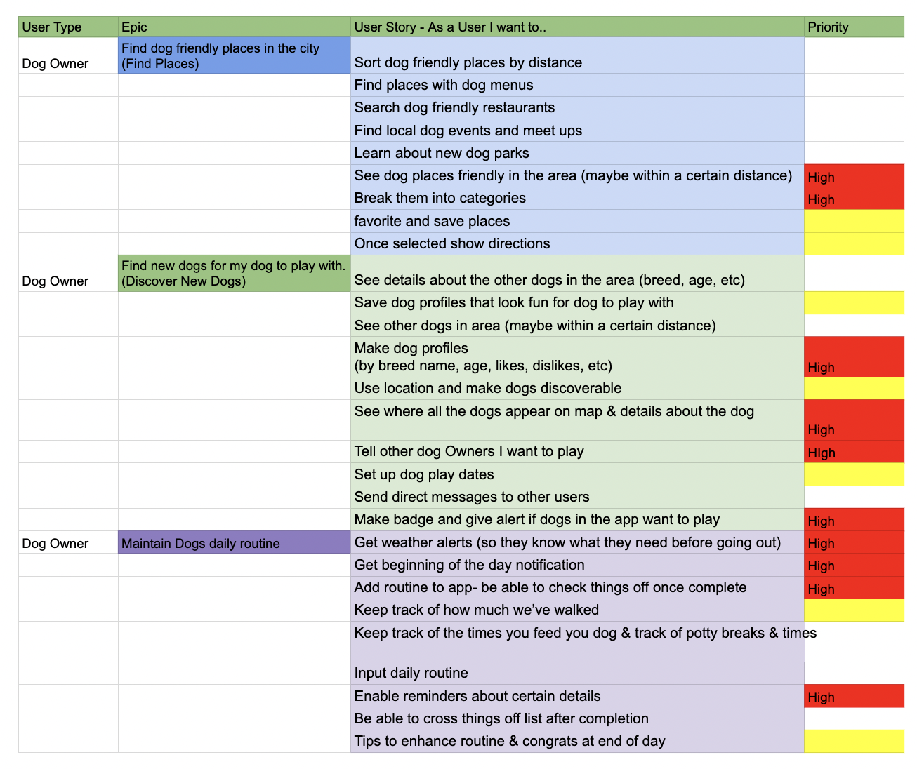
Next I used user stories to help determine solutions to my problem. After listing several things a user needs to do to accomplish a task and why they need to accomplish it. I ranked the MVP’s. I used the high priority task to create my MVP’s.
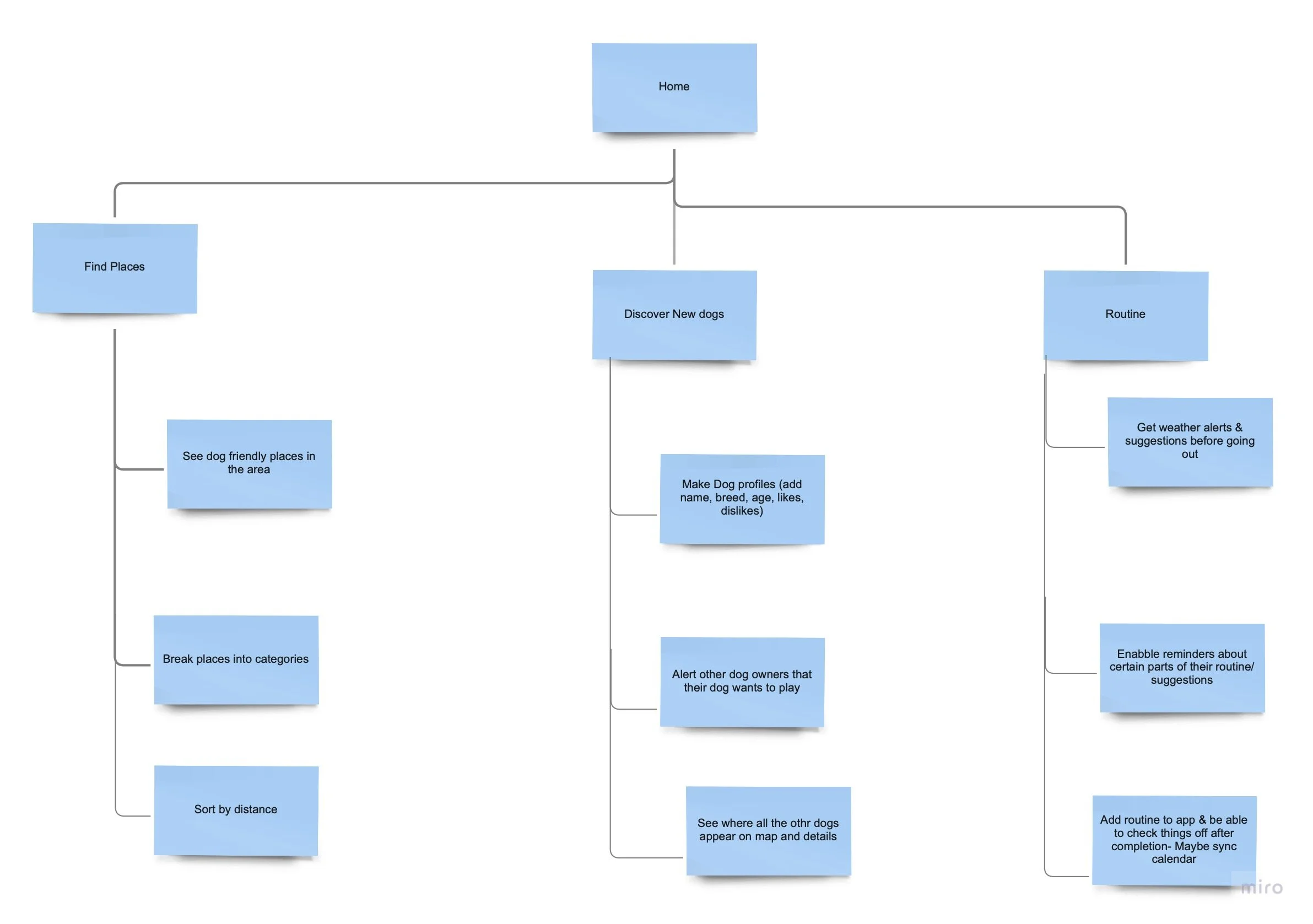
User Flow
Once I determined the MVP’s I created a user flow to visualize the pages better and picture the twists and turns a user would take to help me better interpret how I wanted the app to look and what its overall experience would be.
Initial Sketches
Now that I had my MVP’s and user flows I began to develop an interface that provided a solution to all the high priority tasks. I made sure they could find a variety of places and activities. I added a map so users could see the distance between places since 5/5 of dog owners walked places. Then I created the dog profile ad playdate pages so users could connect with other dogs since 5/5 users said socialization was a high priority.


Guerilla Test
Once I completed all the initial sketches I used my ideas to create a Marvel prototype. I used the guerrilla testing method to test out my ideas quickly. I used this test to determine if:
The app functions were clear
To see how users felt about the overall design of the app
The findings from this testing showed me there were quite a few aspects that weren’t clear and gave insights on what needed to be fixed.
Aspects That Testing told me that needed to be Improved:
Places and Activities needed two different screens
Map feature was not the best way to show places
Add more dog themed elements to design
Wireframes
After guerilla testing I had used the feedback to enhance my initial sketches and I created Wireframes for each of my MVP’s.


UI Design
Once I developed the wireframes I needed to add style and personality to the app. To help me do this I started by creating a mood board. In the mood board I included the brand personality, attributes, color palette, and the imagery and Ui inspiration.
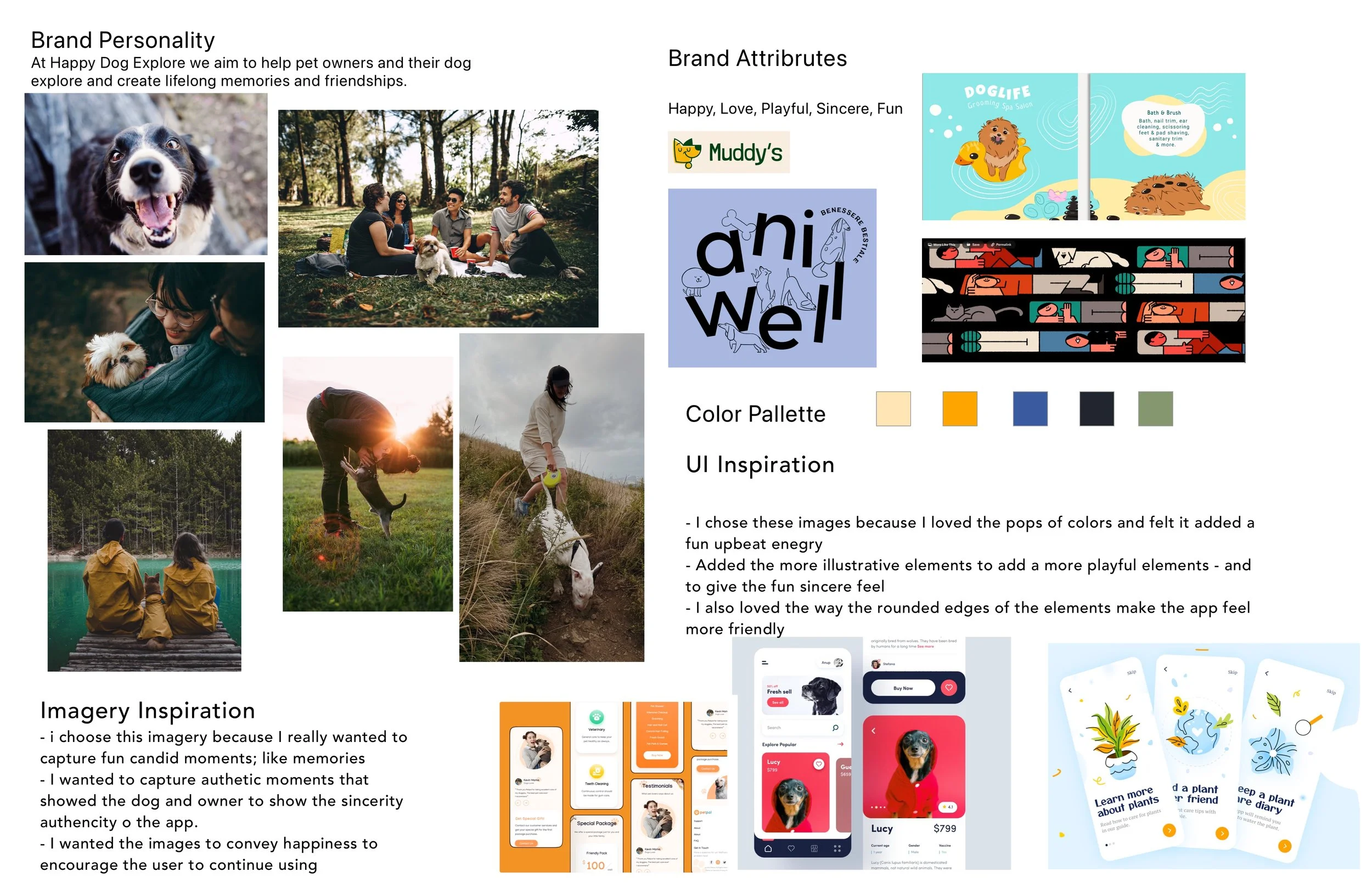
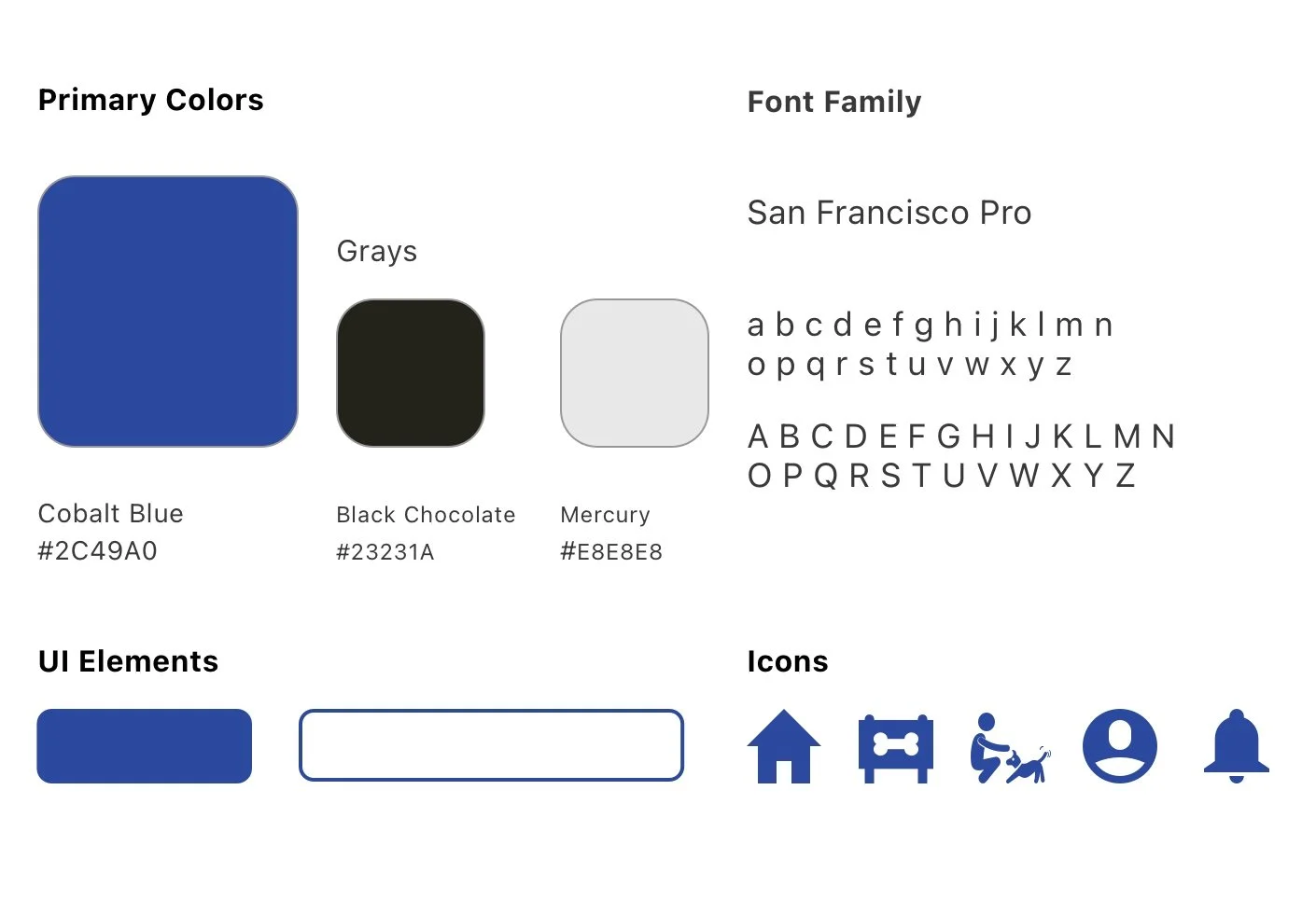
Style Guide
Using the mood board as I guide I selected my primary color Cobalt Blue. Then I created my UI elements and selected the icons I wanted to use in my design.
High Fidelity MockUp
After nailing down the brand’s virtues, color scheme, icons, and the gist of how a user would navigate through it, I used the style guide to create high fidelity mockups of the wire frames.


Usability Testing 1
After creating the high fidelity red routes of my screen, I made them into a prototype in Marvel. I used this prototype to test the usability of the app.
Objectives
If the screens are easy to navigate
Uncover usability issues in red routes
First impression on App design (Do they like it)
Make sure the icons on home screen are readable
I conducted five tests. Two of the tests were done in person and the other 3 were done remotely. The in person tests were done in a quiet room with a prototype. The remote tests were done via zoom using the prototype.I had each user complete three tasks.
Test Scenarios/ Tasks Example
You're out walking your dog with a friend and decide you want to keep hanging out and grab a beer nearby. Find a dog friendly brewery for you and your friend to have a beer.
Usability Test Findings
After conducting usability testing, I learned 5/5 users could complete the task. However I had missed some very important aspects in my prototype that needed to be addressed.
Key Findings From Usability Test 1:
Not enough informations about the places and activities
Not enough info about dog owner and dog for play date
Issues with logo and visibility of headings
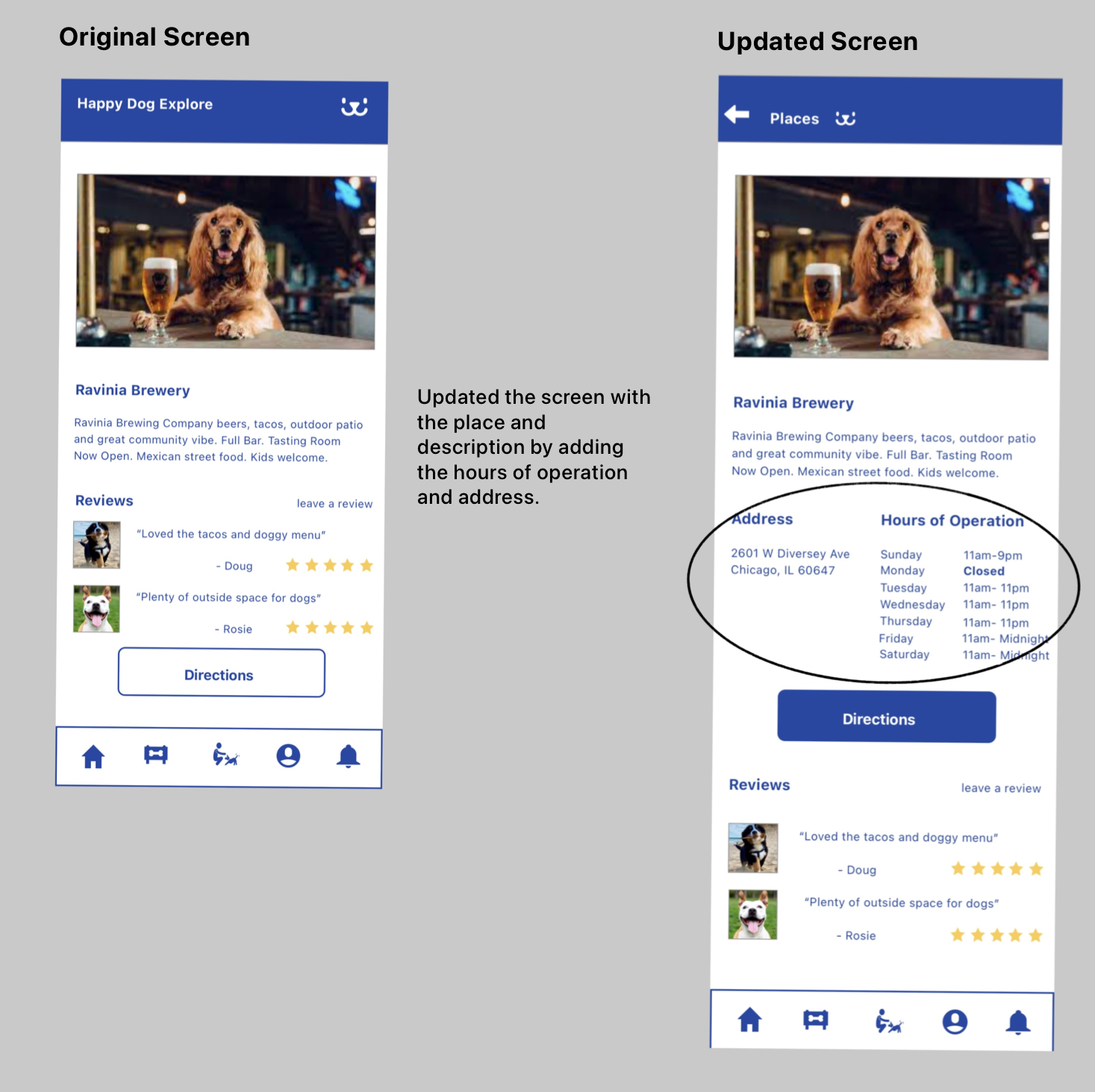
After discovering these issues I went back and made the needed changes to my prototype. I added the address and hours of operation. Included a section information about the dog owners. I also adjusted the headings and moved the logo over so it wouldn’t be confused with a button.
Usability Test 2
After making the changes I went ahead and did another round of usability testing.
Objectives
If the screens were easy to navigate
Ensure the Set Up Playdate route was clear
All the information on was clear and adequate for places and activities
I conducted five tests. All the tests were done in person. The in person tests were done in a quiet room with a prototype. I had each user complete three tasks.
Each user was able to complete the task however there were still things that could be improved.
Key Findings From Usability Test 2:
Clear rules for dogs for each place/ activity
Improve the Select location in Set Up Playdate
Improve search by filtering by temperament
Conclusion- Valuable Lessons
Summary:
This project was so much fun but also challenging. I love dogs and have so many friends and family members who do as well. This really fueled my drive to come up with a creative solution for this problem. This project really got me out of my shell and pushed me to talk and interview a wide variety of people about their pets. I learned how to pivot throughout the project and adjust based on information learned. I gained great skills on research interviews and creating narratives as well.
Key Takeaways
Changes are great
Throughout the design process I had to change and update the design and features based on results from user testing. In the beginning I had pre-solutions for the problem but after interviews and testing I learned that this is crucial information needed to solve the problem and as a designer I should not assume anything about my users and I should instead focus on the facts and be willing to make changes.
User Research and User Testing
I learned user testing is the best way to test the solution and is extremely important. I was very nervous conducting User Testing in the beginning but slowly gained the skills to ask the important questions to really understand my users.
Start Simple
When I first started doing the initial sketches I wanted to include all these animations and features. This made the initial design confusing for users in guerilla testing. I learned the best way to start to design was to start simple and focus on the key screens first then expand on the features later with features my users actually need.